Deadline: the latest time by which something must be done. June was a deadline month leading up to a 3 Woman Art Show at the Logan Fine Art Gallery. This painting:”Any Dream Will Do (The technicolor dream cape)” is a 24 x 36 inch oil that took up a chunk of the month.

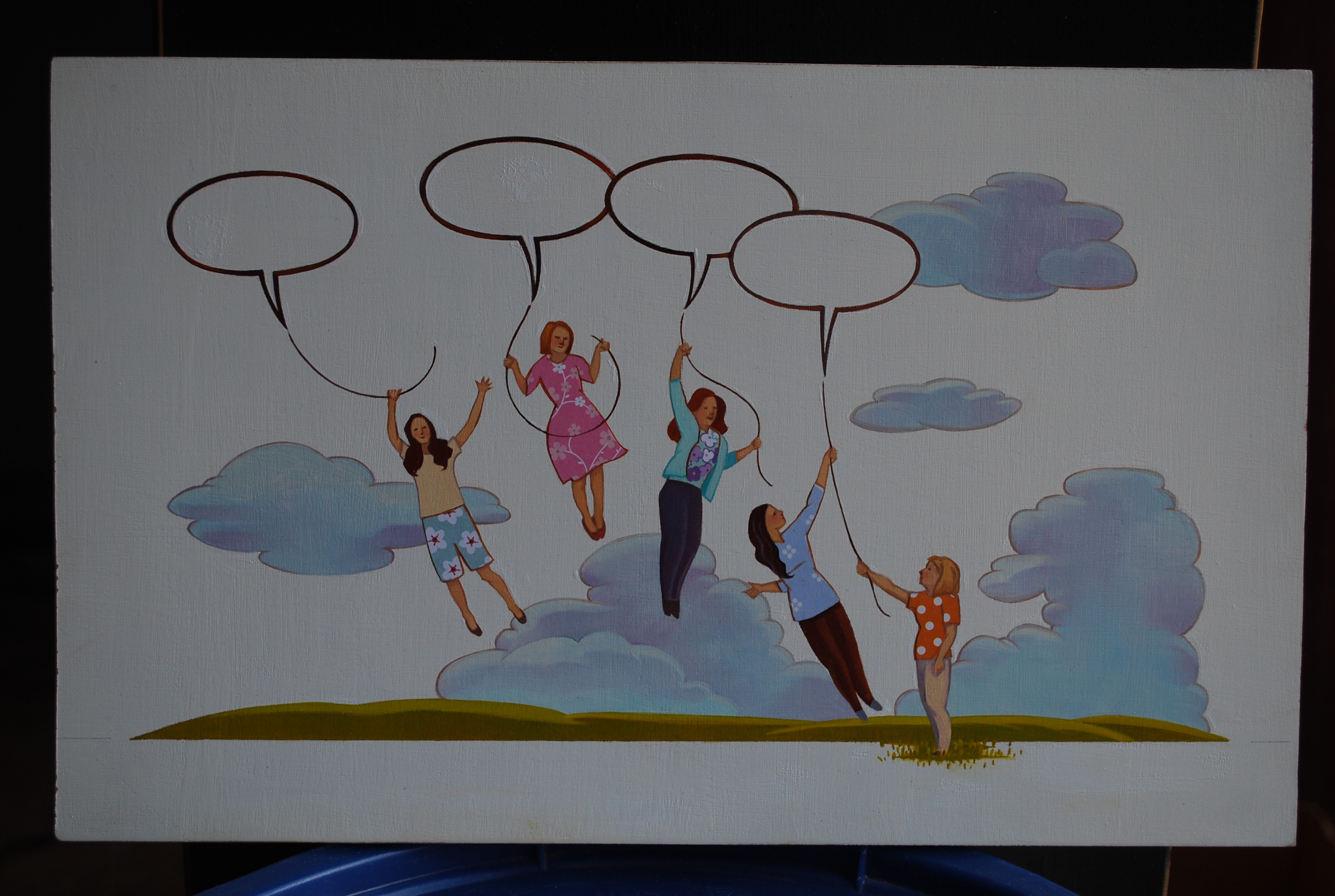
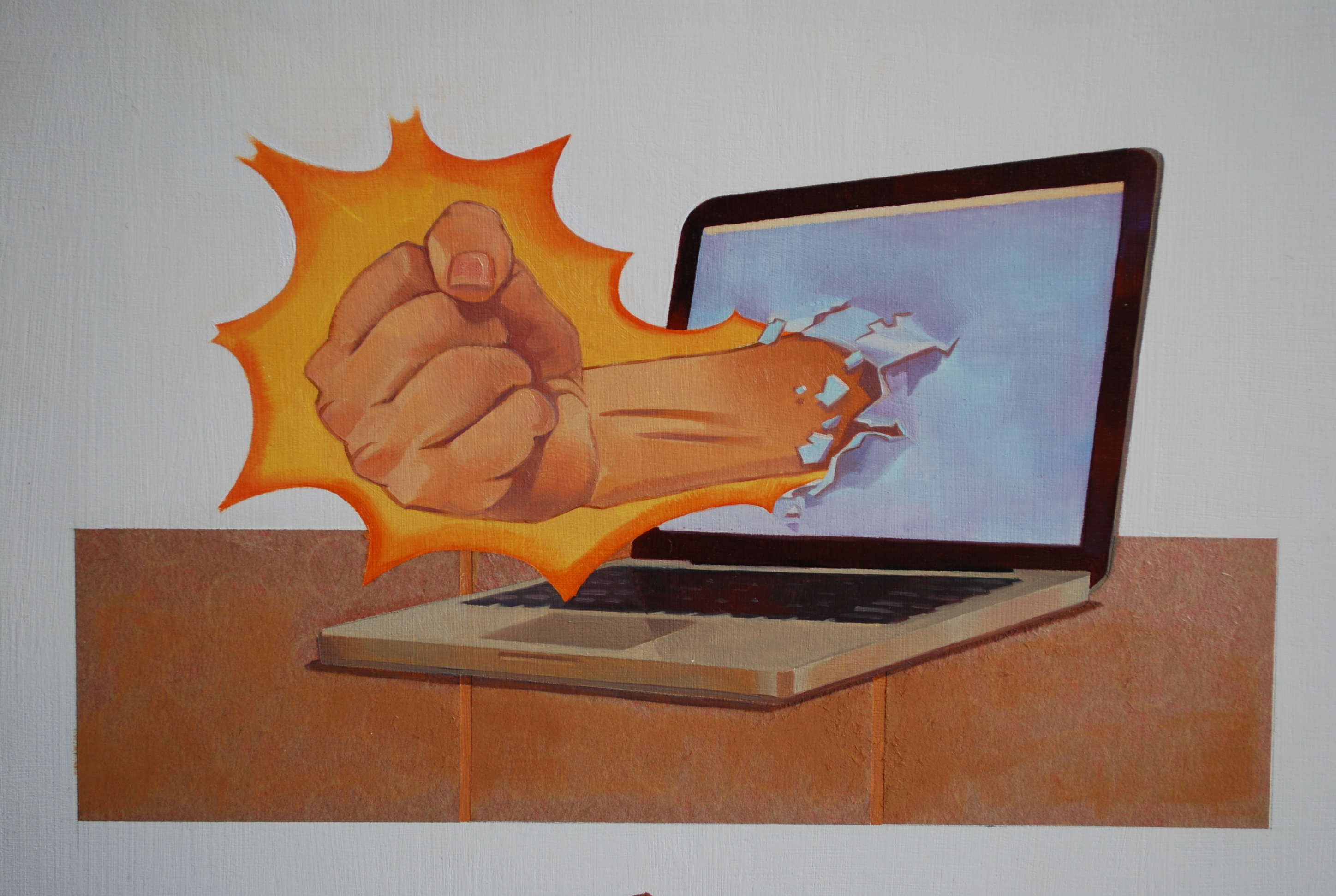
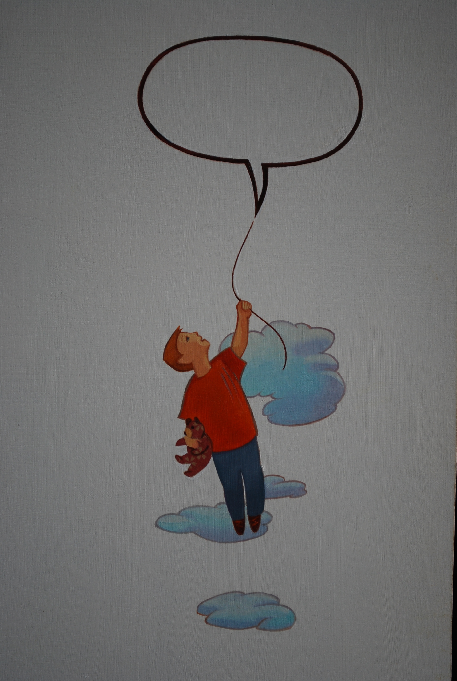
An interesting illustration job about corrupt communication. Hot off the art table. Oil and collage. What we say can tear down or build “float” us up. And then there is cyber-bullying.
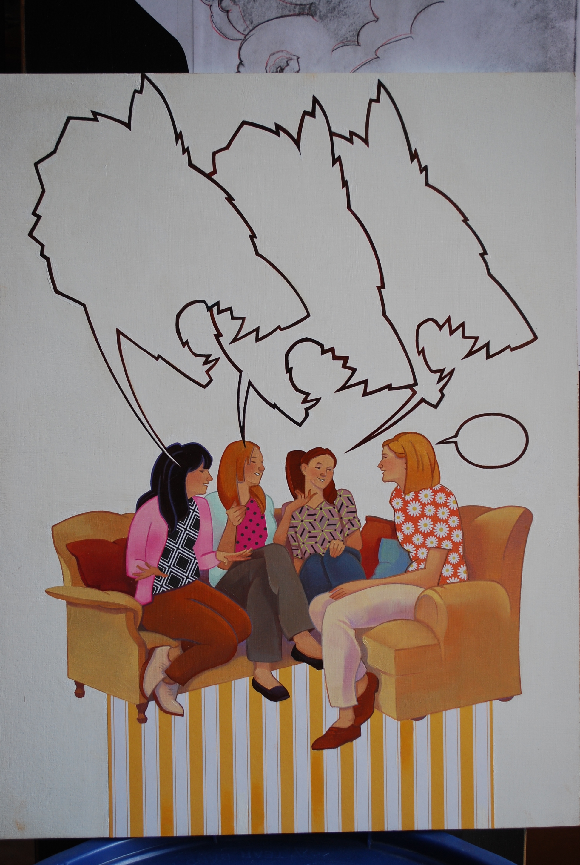
The Greek root for the word sarcasm is sarkazein and means “to tear flesh like dogs”. Ouch.

Siz and Driz and the publishing world.
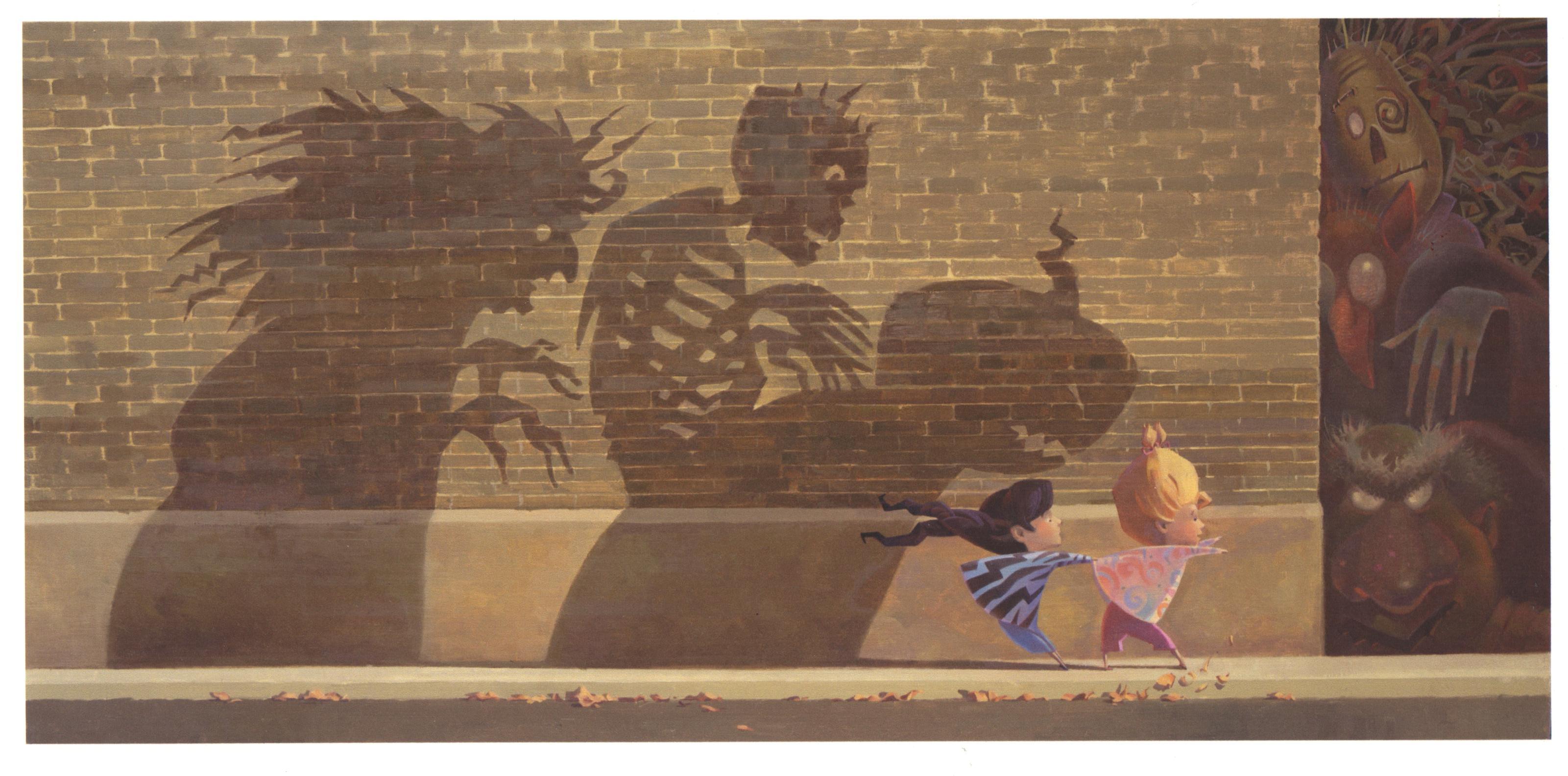
This is my first “fully-operational” illustration for the Siz and Driz storybook, “Around The Corner”. Look out for flarbs and snarbs. I submitted this and my stories to an agency on February 16 of this year. I haven’t heard back. On March 17, if I haven’t heard anything by then, I will hit the trail again, submitting the world of Siz and Driz to another agency. They will not go quietly into the night! They will live on! (movie buff).
The other one that sold as well as being awarded an honorable mention.

This was the other painting that sold at the Dixie Sears Gallery Invitational. And surprise: it was awarded an honorable mention as well. Too much fun! This one is a 12 x 16 inch oil on board titled, “At 5:14pm The Autumn Geysers Erupted”.
Sold both of my paintings at the Dixie Sears Gallery Invitational. Just sharing the joy.
This painting sold at the Dixie Sears Gallery Invitational. It is titled, “Abundance”. It is a 24 x 18 inch oil on board. Yaa-hoo!
Continuing to pursue the dream of publishing as an author/illustrator! Introducing Driz and Siz, little starlets of stories, “Around The Corner” and “It Is What It Is”.
Today, with trepidation and relief I clicked the “submit” button on my story submissions to a literary agency in New York. I am pursuing the process of getting an agent to represent me as an author/illustrator. It has been a year since I sent three publishers a rough outline of one of my stories, “Nightmare Roundup”. I never heard back from any of them. I am wiser and my stories are more refined this time around. I will start with finding an agent. I am reminded of a clever dialog that passed between Buffy the Vampire Slayer and her friend, Willow: “How do you get to be RENOWNED? I mean, like, do you have to be NOWNED first?” -Buffy. “Yes. First there’s the painful NOWNING process.” -Willow. It WAS painful. After the writing, rewriting, rewriting, rewriting . . . and drawing, redrawing, redrawing . . . I thought I had all that I needed to submit my stories. Sat down to submit my stories online and remembered to make a copy to mail to myself for copyright purposes. Copied and packaged stories and sketches. Drove to post office and discovered I was 14 minutes past their closing time. Went back to the computer to attempt submitting again. Carefully worded and filled out the electronic form to the point of submitting when our cat, Frankie, chose that moment to jump up on the computer keyboard and erase all my work. I burst into tears. Composed myself and started again. Pushed the submit button and got an air message that said my 8000KB file was too big for their requested 800KB attachment size. Was really bummed. I am not so computer literate that I could fix that on my own. That was Saturday night. Was inspired Sunday in church with this line from a speaker: “Recognizing something’s potential and not giving up on it.” Monday I got help from a very generous Alphagraphics computer tech, Kathy, who reduced the sizes of my attachments. Have spent the day, today, Tuesday, submitting three stories for consideration. Now the waiting. I feel peaceful. God called and I have just been picking up the phone . . . pursuing the inspiration of these stories and the desire to be published as an author/illustrator.

Fearfully cautious Driz and bubbling blissful Siz. Seven year old sisters adventuring around corners and across playgrounds.
Directions for Creating a Possibility Poster

Choosing a colorful background.

Doing the poster work.


Katie’s eyes and gold pencil charts.
Katie and I invited our next door neighbor, AJ Hurst, to join us in creating these posters for the new year. Therefore, these 2013 posters were produced by a 15, 22, and 60 year old. These can be an art project with any age. I think even younger children would enjoy creating a visual of their hopes, dreams, and possibilities for the new year.
1. Take some time to write down your 2013 possibilities. What projects, intentions, goals, etc. do you have for the new year? Really throw your hat over the wall and write down those things that are always nagging the back of your mind but never get handled. This could be the year!
2. Pick a poster size and color. Our posters were 13 1/2 x 21 inches on colorful art paper. You could use white poster board, but, a bright color background seems to get the art juices rolling.
3. We took a photo of each other with a digital camera. Could have been with our phones. Transferred the photos to the computer and printed out a black and white copy to paste onto our posters. Last year my poster had a color photo of me. This year a black and white allowed me to do some creative coloring. Putting your face into your 2013 possibilities is a great place to start the planning from. After all, this is a visual of your intentions. I put my face upside down, Katie used just her eyes, and AJ not only used her head but several little full figures in various poses of herself.
4. Materials: photo copies, magazines, color cardstock, markers, color pencils, scissors, glue. I’m sure that 3-D items would work too. Whatever you wanted to put into your collage. The collage items will represent your goals, thoughts, themes for the year. I picked an overriding thought from the musical, “Les Miserables”, to headline my year: To love another person is to see the face of God. There are also “charts” on my poster that I can mark off as I accomplish them. My column of “the unexpected” is my longest column. The poster will also become a history of 2013.
5. Hang the completed poster in a place that will keep it ever present!
Possibilities for 2013! Some call these “dream boards”. I call mine a “possibility poster”. Fun art.

2013 possibility poster


Art buddies forever! Me, Barb Edwards, and Roxane Pfister at our Sep 15th Garden Art Show and Sale.

We have known each other since before middle school in Idaho. We have travelled the road of college, family, and ART together. This year we all three turn 60. I say YEAH for the precious decade ahead and to friendships that last and last and last . . .

Posters and cards we sold at our Garden Art Show and Sale, Sep 15. Some still for sale!

Rox and I entered the marketing world of posters and cards at our Garden Art Show and Sale.
Introducing my portrait commission business with a portrait of my parents, Jess and Verna Humphries.

Garden Art Show and Sale, September 15, 2012.

The view, walking up the driveway to meander through the art show in the beautiful backyard.

- Left to right: Barb Edwards, Roger Motzkus, Glen Edwards, Jess Humphries.

- Under the canopy, waiting for the artists to chat: Anna and Susan Lofgren (left), Kay Collett and Jess Humphries (center), and my dear brother, DJ, (right).

- Happy art buyer, Carole Jensen, showing some of her purchases. Dear friend from our days in California.


In the ever changing economic landscape, I, an artist who still needs to pay the electric bill, am shifting my art life in the experiment of “staying alive” while joyfully and “boldly going where” I have not gone for a while. I am the proud teacher of 3 enthusiastic and determined students. One is a private lesson on Thursday mornings and the other two are taught jointly on Wednesday mornings. Although I am still doing the occasional illustration job, I have combined forces with my good friend and fellow artist, Roxane Pfister. We had the pleasure and work of presenting our art to friends and family on September 15, 2012 in a Garden Art Show and Sale. IT WAS LIKE A GREAT BIG HUG OF ENCOURAGEMENT as Rox and I contemplate going on the road with our art show. The event was held in the beautiful backyard of my parents, Jess and Verna Humphries, in the Holladay area of Salt Lake City. We learned some valuable lessons, like: NOT spending so much money on snail mailed invitations that weren’t as effective as we’d hoped, it takes time and a crew (mom, dad, brother, nephew, niece) to set up-so allow plenty of time, the initial expense of display easels and tablecloths is necessary for start up, and having a wide range of prices (including inexpensive posters and cards) is a good way to go. The weather was great (no wind to knock things around). We had a variety of “events”: silent auction, drawing for 2 free 6×8 oil paintings, artist chat (discover your PRIORITIES, establish a STRUCTURE, and NEVER give up-NEVER surrender), and my mom’s homemade wheat bread along with other light refreshments. The event, which lasted from 3 to 6pm, was a heartfelt sendoff on the art adventure road by those dear to us.

The fancy invitation. Yes, we are plucky and courageous.
Sears Gallery Opening Reception Tonight
This painting is titled “Abundance”. It is an 18 x 24 inch oil on board. I am taking it over to the Sears Gallery today. A spot has been reserved for it. Tonight from 7 to 9 p is our opening reception. Four artists: Craig Fetzer, Bonnie Conrad, Sam Lawlor, and myself are showing our works there until the end of August.


Results of my 5 x 5 Project

This is a 16 x 20 inch oil painting. The first of the five paintings I intended to do in five weeks as part of a 5 x 5 Project.
The Final Painting Begins for the 5 x 5 Project
Last night was the beginning of final paint application on a 16 x 20 inch painting of chickens. The first of FIVE paintings I will do in the next FIVE weeks. With a chuckle I begin with chickens. When I was 8 years old I drew a picture of a chicken on notebook paper while sitting with a friend on a cool, cement porch in one of America’s 1960ish suburbs in Idaho. My drawing was smeared and messy, but, I remember thinking, “That was fun!” So began my 50 year art career. The title of this painting is: “Some Left the Meeting at the X with Ruffled Feathers”.


My 5 x 5 Project
There are now FIVE weeks to “show time”. The last FIVE paintings that I sold left room for five NEW paintings to take their place for the four artist storytelling art show at Dixie College’s Sears Gallery in June. FIVE paintings x FIVE weeks = a new adventure in painting. I pulled FIVE ideas out of the idea pile and began last week to prepare them for painting. First I planned each new painting in a small drawing in my sketchbook. Secondly, I transferred the image to the painting surface. I did this by either by tracing an enlarged blueprint of my small drawing onto the paint surface or using a grid to redraw my design to size. Last night I began the painting. Yee-Haw! Of course, the quality of the painting will be the determining fac tor as to whether it makes it into the show, but, the next
 FIVE weeks wi
 ll be an “artist’s ride”!
Getting ready for a 4 artist show in the Sears Gallery at Dixie College in June 2012
I am now focusing on painting for an art show about “telling stories”. I tend to think “allegory” when I paint, so, this is a good fit for me. The title of a painting is part of the poetry of doing art for me. Just finished this one last night: A Happy Man Mending His Fences. 
Working with two young artists in Zion National Park. An Art Project that begins with a Black Line.

